Competition: Map a Dream
Closed
View Results
- Open Date
- 13 years ago2010-06-23 00:00:00 UTC
- Close Date
- 13 years ago2010-08-30 23:59:59 UTC
- Type
- Full Map
- Allowed Engines
- Goldsource, Source
- Judging Type
- Judged (all engines combined)
- Judges
Your task is to map a dream sequence, which is loosely defined as far as maps are concerned.
Dreams include, but are not limited to:
Surreal environments
Completely random environments that make no sense
Nightmares (which are dreams, yes)
Even entirely sane environments (although discouraged)
You will be judged on how creative your map is, but also how it conveys a 'dream-like' state of mind. As dreams vary from person to person, the definition of a dream is very much up to interpretation. So long as you can justify your map as being a dream we don't care.
Entries will be judged by TheGrimReafer and probably another moderator (who has yet to be decided).
Results
Judged By:
 TheGrimReafer
Another day, another round of TWHL competition results!
Having played through all the entries, I feel I need to give special mention to JeffMOD's entry - I really loved the Hammer-esque scene - which is my favourite scene out of all the entries.
One thing I really enjoyed about the entries of this competition is the amount of effort that was put in to create a theme around the mappers' choice of dream. Overall, a quality effort by all entrants, and three very worthy winners. Congratulations!
Now I'll hand you over to the judges: Strider and TheGrimReafer, who have both been so kind as to write up reviews for every entry.
So they took a little longer than we'd hoped, but here they are. Some amazing entries this time, very inspiring stuff. A couple of these places were very close, so don't feel bad if you missed out, there were some hard decisions we had to make! Without further adieu, the results:
(Note: Each map has two reviews, by Strider and TheGrimReafer, in that order.)
Having played through all the entries, I feel I need to give special mention to JeffMOD's entry - I really loved the Hammer-esque scene - which is my favourite scene out of all the entries.
One thing I really enjoyed about the entries of this competition is the amount of effort that was put in to create a theme around the mappers' choice of dream. Overall, a quality effort by all entrants, and three very worthy winners. Congratulations!
Now I'll hand you over to the judges: Strider and TheGrimReafer, who have both been so kind as to write up reviews for every entry.
- Penguinboy
So they took a little longer than we'd hoped, but here they are. Some amazing entries this time, very inspiring stuff. A couple of these places were very close, so don't feel bad if you missed out, there were some hard decisions we had to make! Without further adieu, the results:
(Note: Each map has two reviews, by Strider and TheGrimReafer, in that order.)

Wow. This entry reminded me that you can still work magic with GoldSource. When I found out Zeeba-G had 8 maps in his entry, I thought he was nuts, but somehow he's managed to keep them all at an amazing quality throughout. His entry makes exceptional use of the theme, throwing you into some absolutely inspired locations. On top of that I've never seen a place revisted so many times, but manage to feel so different on every occasion. One little annoyance I had was that there's no clear ending (and there's more than one), as the game never fades out or ends, after you reach the final area, which left me wondering if there was more to do. A little finality would not have hurt. Without wanting to spoil this for other players, I'll just say this entry is incredibly well done, and very inspired. A well-deserved 1st place goes to Zeeba-G.
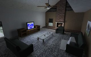
When I sit down to judge, I scribble down the names of the people who entered and the first map to load up so I dont have to leave the game. When I load an entry up, it could have one map or twenty and I would have no way of telling. When I fired this entry up, my first impression was awful. The house was nice and all, but I couldn't find the damned key after searching the house over 5+ times. I thought that would be the entire entry, but soon after noclipping through the door (pff) and getting into the bed this entry became a non-stop train of awesome! The themes are accomplished incredibly well, and the number of small details are astounding. The use of recurring themes and the dynamically changing house is almost poetic even. Its not entirely without issues though. Sometimes the effects are a little too pronounced (most notably in the ice level when you're looking down on the main area), and the ending was unclear. It might've been "clear", sure, but if you've seen Inception you will understand that "Oooh, I must have been dreaming!" doesn't conclude anything at all. Congrats for a well deserved 1st place!
When I sit down to judge, I scribble down the names of the people who entered and the first map to load up so I dont have to leave the game. When I load an entry up, it could have one map or twenty and I would have no way of telling. When I fired this entry up, my first impression was awful. The house was nice and all, but I couldn't find the damned key after searching the house over 5+ times. I thought that would be the entire entry, but soon after noclipping through the door (pff) and getting into the bed this entry became a non-stop train of awesome! The themes are accomplished incredibly well, and the number of small details are astounding. The use of recurring themes and the dynamically changing house is almost poetic even. Its not entirely without issues though. Sometimes the effects are a little too pronounced (most notably in the ice level when you're looking down on the main area), and the ending was unclear. It might've been "clear", sure, but if you've seen Inception you will understand that "Oooh, I must have been dreaming!" doesn't conclude anything at all. Congrats for a well deserved 1st place!

The first thing I should note about Tetsuo's entry is that it instantly hit me with a great ambience - it is very dreamy, and very cool. A whole manner of creative and fun things happen early on, which makes it a bit unfortunate that it loses some of it's creativity as it moves on. The strength of this entry is definitely in the first set pieces, which are fantastic. The later scenes, sadly, aren't quite as inventive, but they aren't by any means bad. There is one somewhat annoying/glitchy sequence, but it's such a good feat in entity set up it's easily forgiveable. Tetsu0 has really impressed with me by how deep he has jumped into the more advanced features of Source.
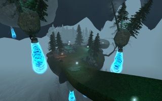
Tetsu0's entry has taken advantage of some of Source's most fine-tuned entities to make a kick-ass Antlion mini-game. Its a real shame that game_ui's and logic_compare's are so underused. Despite not being a 'game', I wonder if he would've placed had the mini-game been entered into "Map a game". Despite the difficult aiming and a few annoying sections of the minigame to beat, I was really impressed. The mini-game aside, this entry had a great ambience to it. The lighting had a cool vibe, but sometimes the heavy fog killed the atmosphere when the islands in the distance turned into ugly globs of gray. The best word to describe the driving track would be "claustrophobic". Some of the turns came up too suddenly and the jump was hard to land correctly. Complaints aside it fulfilled the 'dreamy' niche quite well with its floating architecture and weird lighting. The amount of work involved earns it 2nd place. Congrats!
Tetsu0's entry has taken advantage of some of Source's most fine-tuned entities to make a kick-ass Antlion mini-game. Its a real shame that game_ui's and logic_compare's are so underused. Despite not being a 'game', I wonder if he would've placed had the mini-game been entered into "Map a game". Despite the difficult aiming and a few annoying sections of the minigame to beat, I was really impressed. The mini-game aside, this entry had a great ambience to it. The lighting had a cool vibe, but sometimes the heavy fog killed the atmosphere when the islands in the distance turned into ugly globs of gray. The best word to describe the driving track would be "claustrophobic". Some of the turns came up too suddenly and the jump was hard to land correctly. Complaints aside it fulfilled the 'dreamy' niche quite well with its floating architecture and weird lighting. The amount of work involved earns it 2nd place. Congrats!

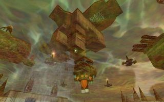
It seems every time I play one of Skals' maps, I'm surprised at just how far he's coming along. The polish on this map is spectacular; it looks fantastic. There is some good nightmarish scripting work done early on, and some even better reuse (and alteration) of space. The first half of this entry plays out very much like a nightmare, while the last half is something entirely different. It becomes a puzzle-centric adventure set in a dried up desert installation where something feels a little off. Perhaps it's the giant mechanical alien thingamajig floating in the sky, who knows. Aside from that, it's never particularly obvious that it's a dream, but dreams can be sneaky like that. On the whole, this is a map pack that's loaded with quality and something Skals should be very proud of.
In a few ways this map qualifies as more of a dream than the other entries. There was always a little confusion about where you were going (its the first time i've ever appreciated a small lack of guidance), plenty of hallucinatory Vortigaunt zappy scenes, and quite often there was a lack of control of the player. I found the occasional lack of control to be very dream-like. Dreaminess aside the architecture was nice, the textures were well picked, and the environments were put together extremely well. My single largest complaint was that the sinks in the bathroom of the first level looked terrible. I dont think I would have paid attention to them if the Vortigaunt in the mirror had not levitated them. My second largest complaint (although it was still awesome) was that the second level dissented from being as "dreamy" as the first. Skals has been producing some high-quality maps lately, and this is no exception.
In a few ways this map qualifies as more of a dream than the other entries. There was always a little confusion about where you were going (its the first time i've ever appreciated a small lack of guidance), plenty of hallucinatory Vortigaunt zappy scenes, and quite often there was a lack of control of the player. I found the occasional lack of control to be very dream-like. Dreaminess aside the architecture was nice, the textures were well picked, and the environments were put together extremely well. My single largest complaint was that the sinks in the bathroom of the first level looked terrible. I dont think I would have paid attention to them if the Vortigaunt in the mirror had not levitated them. My second largest complaint (although it was still awesome) was that the second level dissented from being as "dreamy" as the first. Skals has been producing some high-quality maps lately, and this is no exception.
GoldSource Entries
Cstrikeman
I have to mention that Cstrikeman forgot to include a readme with his entry, leaving me guessing just what game it was for. Luckily, I got it in one. Unfortunately that's where I felt my luck ran out. It wasn't a particularly poorly mapped out entry, but it was by far the most annoying entry of the whole competition. The gameplay consisted entirely of guesswork and impossible-reflex traps. I've never had to quickload this much in the space of 5-10 minutes, and even then I had to resort to cheating to pass one of the traps. It was very frustrating, and didn't honestly feel all that dream-like. That being said, lovers of maps like Hunter's '5 ways to die' will probably get a kick out of this, it's like the Ninja Gaiden of tricks 'n traps maps. Very hard, ridiculously fast, and you'll probably feel like a ninja if you pass it.
I loved this entry because of how spontaneously unfair it was all the time. By the end, when I was teleported to the final room, I was so paranoid that I crouch walked all the way through it to find that it had no traps. I beat it legitimately too, which makes Me > Strider. As far as the competition is concerned it doesn't do well at all. The texturing and architecture are both quite uniform, and there's really nothing "dreamy" about it.
Deathan
Deathan has given us a neat little deathmatch map for his entry. The layout is very basic, but the visuals are great, and suit the theme well. I can see some cheap spawn-kills happening with low numbers, but the layout should make for a pretty intense free-for-all with the right player count. There are unfortunately a few problems, the first being that there is a kill trigger surrounding the map, and it's design is no different from a see-through wall that circles the centre of the map, which is confusing at first. Another being some jump pads seemed pretty underpowered, stopping me from reaching a deviously placed Gauss-gun. Visually the map is great, as I said. It feels lush, and is definitely somewhere I'd like to visit in my sleep. All-in-all it's a nice, small entry.
This map had a great feel to it. The blend of grass and clean concrete give it a very safe and modern vibe. I would've liked to see it taken further though. Visually it had a unique look, but the lighting was a little dingy. For a free-for-all deathmatch map I found it to be a little open; There is absolutely nowhere to hide. The jump pads are also a little small and underpowered to be used in the middle of a deathmatch game with ease. I also found the instant-death outer wall to be somewhat unreasonable. A solid wall (like the inner wall) or maybe even an electrocuting push back into the map would have been more accident-tolerant. Gameplay complaints aside, this map was cool for what it is.
Source Entries
DarkTree
DarkTree's entry is a short, fairly basic entry. The idea is there, but it feels a little rushed. The theme usage is good, with the map changing inexplicably, as dreams often do. And the gameplay is fairly fun, the majority being platforming that leads up to the standout scene - a giant, seemingly Escher-inspired hall of stairs. It's a shame that it's all dev-textured, and that no really twisted gravity-defying entity work is there to complete it, but it's a novel idea. Following that is a very trippy pulsating pathway that looks damn cool. Unfortunately, it ends soon after that, feeling like it had only really just begun. All-in-all, aside from one-or-two cool ideas, it's a pretty simple map. This isn't a bad thing, but given some of the entries it was up against, I would like to have seen more.
This map had a great first impression with me. The emptiness of the map, the lone zombie, the crows, and the fog suited the opening scene really well. The super-elevator door portal really caught me off guard, which is a really cool effect. Regrettably this entry is too short to place. The dev-textured puzzle room was more straightforward than I was expecting it to be. A room with floating staircase objects usually means gravity twisting puzzles, but there were none to be found. Later towards the end I didn't like that the wake-up sand was floating in mid air above the walkway before the staircase was activated. The end felt like a rushed afterthought. This entry wasn't bad by any means, but it could have been taken a bit further.
DocRock
DocRock's map is a HL2:DM map with an unusual, and original setting. A castle in mid-destruction, frozen in time as some unknown force is blowing it to pieces. There is some very nice brushwork on display here, with bits flying every which-way and some very nice architecture in general. The downside is that the texturing is pretty bland, with only 4-5 textures in use, total. The lighting also could really benefit from a nice colour boost. Gameplay wise, it looks to be a very balanced map, weapon spawns seem very practical and the layout, with the exception of some unclear teleporter usage, flows pretty well. The only thing stopping me from giving this a higher rating is that for a map you'll be spending so much time fighting in, it's too overwhelmingly grey - there's just no particular points of interest. This wouldn't be hard to fix with an art pass, and I hope DocRock revisits this map to do so.
Every time I play a Source entry I hope it does something with Source's unique physics engine. Luckily this map doesn't do that. If the laws of physics were suddenly applied this entry I'm mostly sure my computer would explode. The architecture is good (I wonder how many off-grid vertices there are), and the textures suit the theme well. The over-use of the same few textures and the uniform lighting makes much of the map quite easy to get turned around in, however. At first I thought the Combine-metal walls was just an awful texture choice. It could have been made more clear that they were teleporters at all. All in all this map had a unique theme and a cool idea, but it could've rated a lot higher with some final touches.
JeffMOD
A very solid entry from JeffMOD. It shows a great understanding of the Source principles, and a clever interpretation of the theme. One area in particular was very inspired (If you've played it, you'll know what I mean), and put a grin on my face. His entry seems to alternate between a dream Gordon might have over his adventures, and a nerdy dream one of us mappers might have, and it works superbly. If I had to complain about one thing only, it would be that the HDR is a little overboard, but it is a dream, so it just seems to fit. Throw in Triage at Dawn (love that song), and a nice ominous ending (which I unfortunately had to trigger through the console, once I got stuck in a camera view), and you have a great little entry, with some unique ideas at play.
This was a neat entry in that you got to see a little bit of everything. It visits a few places around the Half-Life universe ranging from a map's infancy in Hammer (which was awesome) all the way to Nova Prospect. Most of the areas were filled with tons of nice little details, and the use of Gman was great in a nightmarish sense. The largest thing that I didn't like about the entry was that it was quite linear. There wasn't much in the way of exploration because the entrance to the next area was always blatantly obvious. It felt quite boxed in. Also in some places the consistency of the mapping quality took a hit. The alarmed hallway felt more like an area-bridge than an environment worth looking around. This map was an extremely close toss-up between Skals' entry for third.